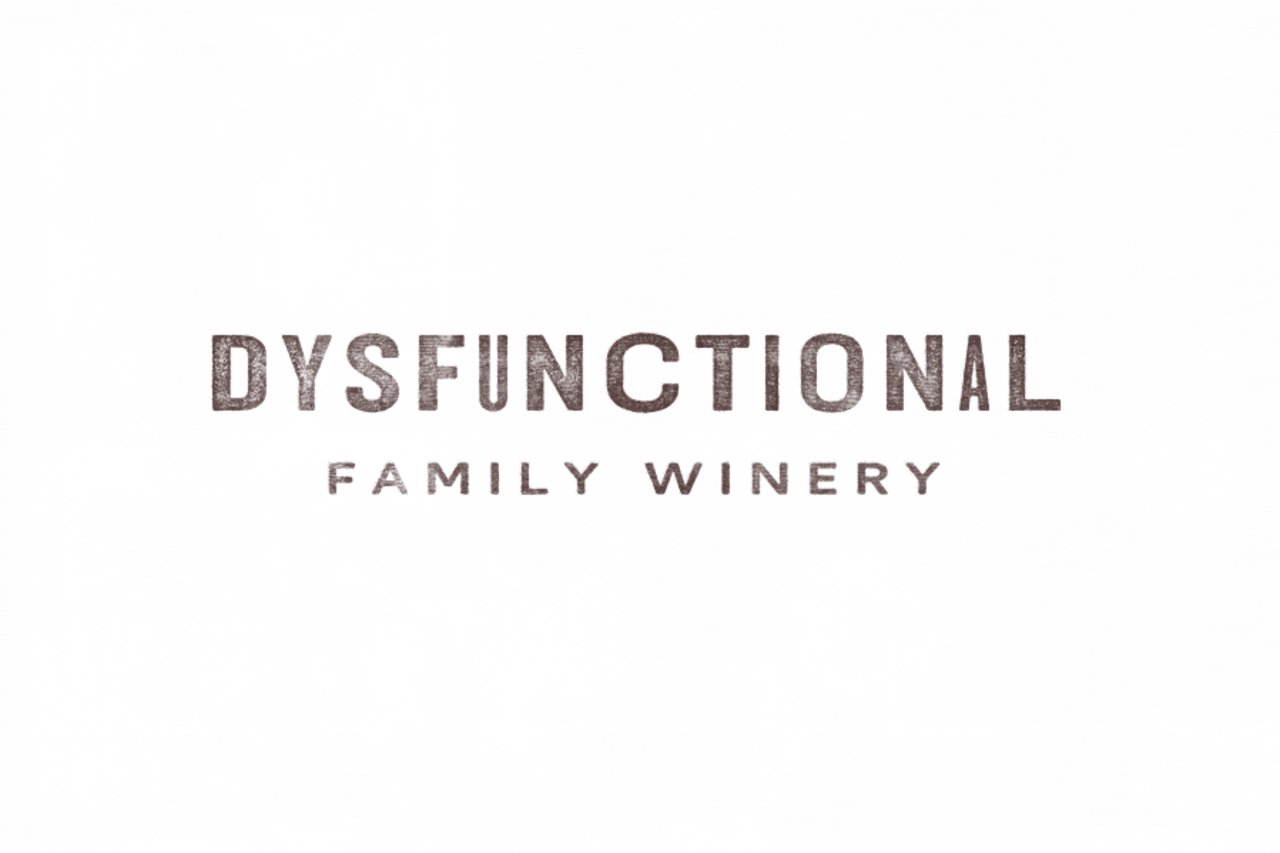
Dysfunctional Family Winery

While working on Sonocaia Estate Vineyard, Ken Wornick also hired TreeHouse to create a new look for Dysfunctional Family Winery.
Dysfunctional Family Winery is another winery on the Sonocaia Estate. This more casual, quirky label can be considered the eccentric cousin to Sonocaia. This is still serious wine but with a more whimsical twist.
Our mood board and explorations into creating a mark and brand were challenging as we tried to find a balance between the often stuffy and traditional Italian winery aesthetic and this rugged all-American rancher in cowboy boots riding a motorcycle…
The final aesthetic is the American Old West meets rural Italy. Bold typefaces, woodblock printing, and a handmade artful touch. Loel Mitchell created the wordmark using Hoefler & Co’s Knockout typeface in varying widths with subtle adjustments to each letter to create an edgy look. It works wonderfully on labels or signs but holds up to more rustic printing with heavily distressed textures.
Our deliverables were a brand guide, logos, accompanying graphic assets, and the wine labels for their next bottling. We also created the concept for the DFW page within the Sonocaia website we also designed in partnership with RAD Web Marketing.

