Dedication to Special Education

Dedication to Special Education is a non-profit partially funded by the Marin County Office of Education. Their mission is to improve the quality of special education in Marin County public schools, while connecting families for a stronger community.
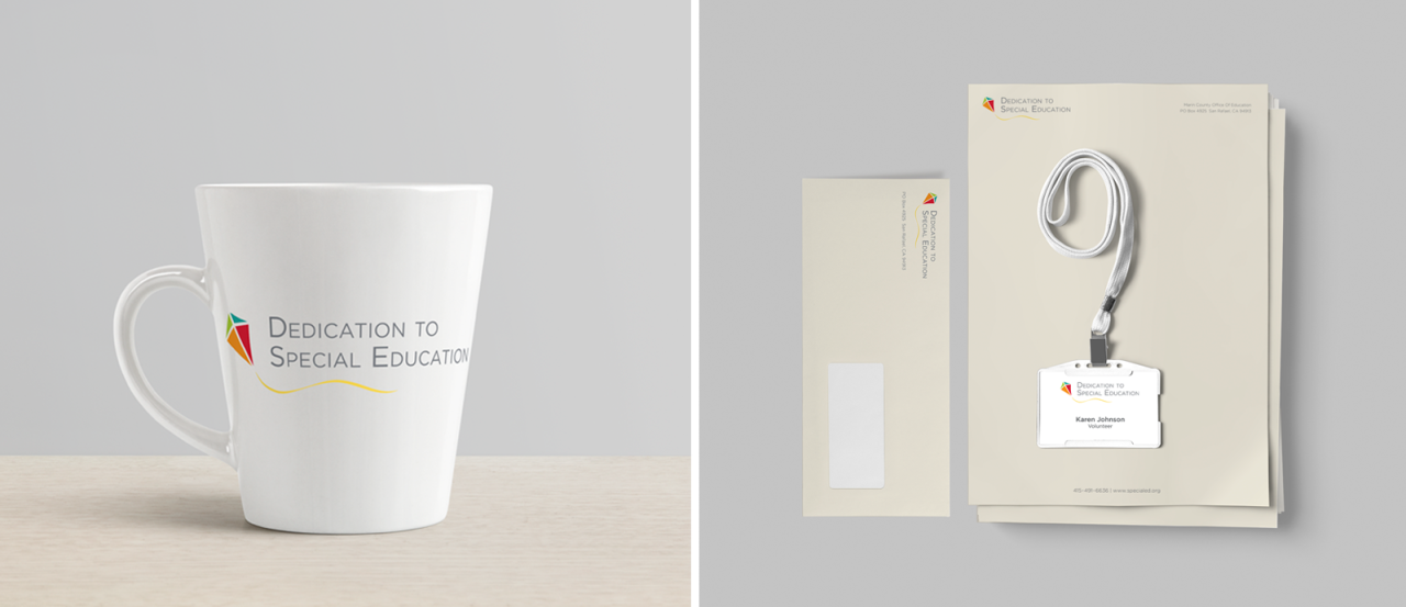
The pieces of the kite symbolize the parts of the community coming together to make it possible for a child who is struggling to thrive and take flight. The colors were based on research of current color trends and a knowledge of brand application in their future. They remind us of popsicles on a summer day, youthful, carefree and happy.
After rolling out the logo and style guide, Stacey designed a new print brochure for the organization. We used the new branding scheme to create a visual hierarchy that was very clear and readable to accommodate a target audience who may have difficulty with small type.
We design annual fundraising campaigns for DSE which include posters, banners, signs, direct mail cards, raffle tickets, programs, invitations, social media assets and more.


